学习笔记
Flex 布局
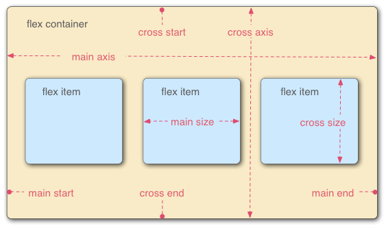
Flex 是2009年提出的新的布局方案,用来代替原来的盒状模型。
容器属性
flex-direction: 主轴方向
决定主轴的方向(即项目的排列方向)
-
flex-direction: row(默认值):主轴为水平方向,起点在左端。Show
123 -
flex-direction: row-reverse主轴为水平方向,起点在右端。Show
123 -
flex-direction: column主轴为垂直方向,起点在上沿。Show
1234 -
flex-direction: column-reverse主轴为垂直方向,起点在下沿。Show
1234
flex-wrap: 是否换行
默认情况下,项目都排在一条线,flex-wrap 可以设置拍不下之后换行
-
flex-wrap: nowrap(默认):不换行Show
123456 -
flex-wrap: wrap换行,第一行在上方。Show
123456 -
flex-wrap: wrap-reverse换行,第一行在下方。Show
12345
flex-flow: direction+wrap
flex-flow 属性是 flex-direction 属性和 flex-wrap 属性的简写形式,默认值为 row nowrap。
-
flex-flow: row wrap水平,换行Show
12345 -
flex-flow: row nowrap水平,不换行Show
12345
justify-content: 主轴上的对齐方式
justify-content 属性定义了项目在主轴上的对齐方式。
-
justify-content: flex-start左对齐Show
12345 -
justify-content: flex-end右对齐Show
12345 -
justify-content: center居中Show
12345 -
justify-content: space-between两端对齐Show
12345 -
justify-content: space-around左对齐Show
12345
align-items: 交叉轴上的对齐方式
align-items 属性定义项目在交叉轴上如何对齐。
-
align-items: flex-start交叉轴的起点对齐Show
12345 -
align-items: flex-end交叉轴的终点对齐Show
12345 -
align-items: center交叉轴的中点对齐Show
12345 -
align-items: baseline项目的第一行文字的基线对齐Show
12345 -
align-items: stretch如果项目未设置高度或设为auto,将占满整个容器的高度Show
12345
align-content: 多根轴线的对齐方式
align-content属性定义了多根轴线的对齐方式。如果项目只有一根轴线,该属性不起作用。
-
align-content: flex-start与交叉轴的起点对齐Show
12345678auto -
align-content: flex-end与交叉轴的终点对齐Show
12345678auto -
align-content: center与交叉轴的中点对齐Show
12345678auto -
align-content: space-between与交叉轴两端对齐,轴线之间的间隔平均分布Show
12345678auto -
align-content: space-around每根轴线两侧的间隔都相等。所以,轴线之间的间隔比轴线与边框的间隔大一倍。Show
12345678auto -
align-content: stretch轴线占满整个交叉轴。Show
12345678auto
项目的属性
order: <integer>: 项目的排列顺序
Show
100
-1
9
0
1
flex-grow: <number>: 定义项目的放大比例
默认为 0,即如果存在剩余空间,也不放大。
Show
0
0
0
1
1
1
0
1
2
flex-shrink: <number>: 定义了项目的缩小比例
默认为1,即如果空间不足,该项目将缩小。
Show
0
0
0
1
1
1
0
1
1
flex-basis: <length> or auto 在分配多余空间之前,项目占据的主轴空间
浏览器根据这个属性,计算主轴是否有多余空间。它的默认值为auto,即项目的本来大小。它可以设为跟width或height属性一样的值(比如350px),则项目将占据固定空间。
Show
auto
100
100
auto
flex: flex-grow + flex-shrink + flex-basis
默认值为 0 1 auto。后两个属性可选。 两个快捷值:auto (1 1 auto) 和 none (0 0 auto)。
- flex: auto
Show
autoautoautoauto - flex: none
Show
nonnonnonnon
align-self: item 的对齐方式
允许单个项目有与其他项目不一样的对齐方式,可覆盖align-items属性。
Show
1
2
3
4
5